REVIEW: THE ATLAS OF THE REAL WORLD : MAPPING THE WAY WE LIVE

The Atlas of the Real World: Mapping the Way We LiveThe Atlas of the Real World: Mapping the Way We Live by Daniel Dorling
My rating: 4 of 5 stars

This book originally lent to me by Orestis from uni. In fact, if I recall correctly, he’d borrowed it from someone else first. In a weird twist of fate, I have become that shadowy person responsible for lent books gone AWOL. The person everybody loves to hate.

It’s not hard to get what this book is all about: it’s 366 maps that are much more infographics about human life on Earth than they are maps.

Greece doesn’t rank high in almost any of these expected or unexpected lists and their respective cartographic representations, apart from the follwing two, which stuck out for me—links are to the book’s source website, Worldmapper, which contains all 366 maps included in the publication for your viewing pleasure).


Mopeds and Motorcycles

“The Asian regions (Southern Asia, Eastern Asia, Asia Pacific and Japan) are where 65% of mopeds and motorbikes are driven. Mopeds are less powerful than motorbikes, having slower maximum speeds because of their smaller engines. Some mopeds can also be pedalled. This form of transport has an advantage over cars in that motorised bikes can be taken on narrow roads and paths. On the other hand the rider is more vulnerable to injury.

Malaysia and Greece have more than one motorbike / moped for every five people. Considering that some people will be too young to drive, this could be one bike per three people in the relevant age group.


Total Elderly

Greece’s percentage of people over 65 (wow, that includes my dad!) is ranked fourth in the world, after Japan, Germany and Italy. Doesn’t this suddenly make the whole pension crisis seem way hopeless? Also see: why Europe’s aging population means that the EU need to welcome 20 million immigrants by 2030 to replenish diminishing workforce.

If this book could have always up-to-date info, and not stuck in 2008 at best, it would earn its 5 stars. But I’m sorry review, I’m afraid I can’t do that.

View all my reviews

AN OVERVIEW OF WATER MANAGEMENT IN URUGUAY


Article originally posted in the Rights4Water Website.

Uruguay is the second smallest country in South America (after Suriname), with an area of 176,215km2, making it about 15% smaller than Belarus and 35% larger than Greece. A total of 3,324,460 people call it home and about 1,947,604 (or roughly 57% of the population) reside in the Montevideo metro area on the Río de la Plata. In fact, its urbanization rate is over 95%, one of the highest in the world. Meanwhile (and perhaps contradictory to the previous statistic), close to 93% of its territory is apt for agriculture or pasture, and with existing cattle numbers surpassing 12.000.000 in 2014, Uruguay is world champion of cattle per capita. To reiterate: for each Uruguayan that lives in an urban centre, there are 3.6 bovines living in its vast fields.

The fertility of Uruguayan soils would likely not be possible without its vast river network, which is mainly defined by Río Uruguay and important tributaries in its basin, such as Río Cuareim and Río Negro; Río de la Plata and its tributaries (including Río Santa Lucía, which provides water for Montevideo) and others. OSE is the country’s main public water company, while DINAGUA (the National Water Directorate), along with MVOTMA (the Ministry of Housing, Land Management and the Environment) and a number of other government directorates are responsible for managing Uruguayan water resources.

Major basins in Uruguay

Major basins of Uruguay

Privatization of management, with some exceptions, has been largely avoided due to the 2004 plebiscite promoted by the National Commission in Defence of Water and Life. The plebiscite, ratified by 64,58% of voters, resulted in a constitutional reform and the inclusion therein of the now famous Article 47. With it, the Uruguayan constitution was the first in the world to give the state sole authority over water management, making privatisation unconstitutional, explicitly stating that “users and civil society are to participate in all planning, management and control of water resources”. In addition, it declared water “a natural resource essential for life” and made access to water and sanitation “a fundamental human right”.

More than a decade later, management of water in Uruguay is now organised by river basins and hydrographic regions: they are the basis for the regional and basin councils regularly called by DINAGUA. These councils, which are meant to be tripartite, allow the participation of delegates from the government, the users (agriculture, pastures etc) and civil society, and are convened to discuss matters of water quality, regional development plans, emergency situations such as droughts, good practices etc. The inclusion of the citizenry in the management of water resources, as mentioned above, became a constitutional right as a direct result of the referendum. However, until now, these councils have been the only formal way of allowing the citizens to have any say in water management and control.

Regional council in Las Cañas, Río Negro

There have been more problems with the actual implementation of Article 47. Apparently, compartmentalisation of power over water resources has become a problem of management: “The water law (predicated by the constitutional reform) is based on management by basin; the territorial legislation law is based on management by political boundaries, by regional department”, says Carmen Sosa, current member of CNDAV and representative of the worker union of OSE in her interview to Rights4Water. “Since authorities for each river basin are so compartmentalised, we need to examine the difficulty of managing water in such a way. It was our inspiration to have a single organisation, a ministry of water, a ministry of the environment, which would bring all the powers together in a single place. For when authorities are so dispersed, when the responsibilities are so dispersed, in the end nobody’s responsible. Management is very complicated when there are ten different organisations in charge—and all with the same level of responsibility.”

Carmen Sosa

According to Mrs. Sosa, the state could make popular participation more viable by making the regional councils and the information discussed therein more accessible to the citizens. “Oftentimes the only thing people know about is the problems that they have: how their neighbour’s well dried up, or how their own water is polluted. But they do not have any information on the context and on what state the country is in for such things to happen.” Most of the councils are presently working with the most serious water-related problem the country’s facing right now: the contamination of the basins by run-off from its soy plantations and its pastures. We shall go more in-depth about this in our next article on water as a human right in Uruguay.

ME, MYSELF AND FULFILLMENT // CUBILONIA

Thought you knew the real origin of the name Cubilone? Well, you thought wrong, because in the following video I reveal all for the first time.

Jokes aside, I prepared this video as part of the online preparation for the upcoming training in Olde Vechte in the Netherlands, the same place I did I SEE GREEN in February-March 2013 and REDUCE, REUSE, RECYCLE in November of the same year, for which I never wrote anything of note as far as I can recall, so clicking on the words will do nothing particularly significant.

Supposedly, this video is for presenting myself to the rest of the international group and what fulfills me in life. That was the mission. Do you think I managed to do it? I set off with high expectations but the impressions I’ve got from other people (apart from you Daphne and Mario!) have left me wondering. I can certainly say I had high expectations from the idea, and still do (the things I can write about Cubilonia! I could fill books with interesting things about that place) but I’m disappointed in, you know… why should I do it?

Looking for inspiration; maybe find it, proceed to let other people influence outcome too much; idea that felt awesome looks ridiculous in the space of a single hour when faced with awkward reception and blank stares. Artists shouldn’t listen to what other people think. Right? Artists and creatives don’t create for anyone but themselves. Right? Self-expression is of top importance. Right?

EVS in Sofia City Library Blog: Bulgarian Lessons

Здравейте! Това е първът път, че пиша в български на компютъра. Уф, е много трудно с друга клавиатура…

One of the great things about EVS is that it gives you the opportunity to have proper classes for learning the language of your host country. For us, this means at least 120 study hours over a period of a few months, and right now we’ve done exactly half of that.

We have lessons on Monday and Thursday mornings in Zazy Language Centre, which is located on Vitosha Blvd right next to the Palace of Justice. Quite a central place to have lessons, right?

This is the entrance to the building – okay okay, I know what you’re thinking, but, if you get down to it, it’s nothing more than a photograph of a public place! The relevant jokes one can come up with from the fact that the entrance to a fetish club is the same as the entrance to where we have our language classes are rather obvious and I’ll leave them to your own sick imagination!

This is the place where we get our капучино (cappuccino) during our почивки (breaks). Did you notice that the shop is called “Kinky”? Are you noticing a mysterious pattern here? It’s not just me, right?

On a completely unrelated note, in the class itself I’m always sitting opposite this map.

I’m sorry, this has very little to do with our Bulgarian, but I just have to get it off my chest. What is this map? I’m a big geography and map nerd so bare with me, but what’s that… peninsula jutting out from the East of Finland towards Svalbard? What’s that island to the East of the Dominican Republic and Haiti, like a hydrocephalic Puerto Rico? Oh! Maybe MacMillan accidentally revealed the true location of Atlantis, what mapmakers, satellites, Google Maps etc. have been meticulously hiding for millennia. Thank you, MacMillan! The truth is out there.

Sorry for that. I just wanted to share with this little thing that continually catches my attention during the Bulgarian class.

From left to right: Oles, Hanna, Zanda, Maria,
Zlatko (our teacher), Vicente and Jeroen.
Maria from Spain was absent that day but I really
wanted to take the picture exactly then.
Don’t worry Maria, I haven’t forgot about you!

Now, this is our class. That’s us, the Library volunteers and the guys from Smart Foundation. This is the place where the magic happens. We hope that in the following half of our 120 hours we’ll learn just as much, if not more, than what we have learned already, and some day soon we’ll be ready to walk up to any baba or dyado and ask them for directions, order properly at the underground cantina next to the library with the handwritten menu with the green marker (have you seen handwritten Bulgarian??), understand what they ask us at the supermarket after we say the predictable things, which usually leaves us like deer in headlights… maybe even read some Bulgarian books! Yes, that’d be great indeed.

So, until the next attempts to actually write a post in Bulgarian, довиждане! (dovizhdane)

Review: On the Map: Why the World Looks the Way it Does

On the Map: Why the World Looks the Way it DoesOn the Map: Why the World Looks the Way it Does by Simon Garfield

My rating: 3 of 5 stars

I bought On The Map from Schiphol Airport when it caught Daphne’s eye in an AKO. It looks at cartography from numerous and very different angles: the digital (or tabletop), imaginary map of the contemporary game; the history of cartography from Ptolemy to Eratosthenes and from Blaeu to Mercator -and the fight between different projections and why the one bearing the latter’s name escaped its intended use for navigation and remained revelant in the 21st century; neurology’s attempts of mapping the brain; the medieval spirit of map-making that was vastly more interested in the representation of myth and fable than of actual space; the revolution -and problems- brought about by the introduction of GPS; even a more in-depth look at how men and women look at maps differently -note: not necessarily with the men being flat-out better at reading maps as is commonly believed, it’s a bit more complex than that- and many more.

My main problem with the book was that it was too geared towards Brits: there were just too many chapters on the Ordnance Survey, the creation of the London A-Z, John Snow and how he stopped cholera (don’t laugh!), the story of the London Underground iconic -and first of its kind- stylised chart (okay, that one was interesting) and others that were just too specific for me. Plus, Simon Garfield’s style was somewhat… dry, I’d say. It couldn’t convey the thrill I usually get from looking at maps (or creating them, as is the case with many of my favourite PC games), letting my imagination and abstract mind go crazy in the process. There was some magic lost here.

The chapter on the world’s atlases, on the other hand, had me salivating all over. Just for a taste: Blaue’s Atlas Maior (1665), The World Geo-graphic Atlas (1953) and The State of the World Atlas (1999, with recurring editions – nine to date). Unfortunately, the book’s black & white illustrations, scans and pictures, while indeed helping to keep the price low, didn’t help with making the maps look their best. Thank you Google DuckDuckGo.

To cut a long story -okay, maybe not so long- short, I’d say that the book was okay; a useful reference but not as mind-tickling as I’d have liked it. If you like maps though, don’t let me stop you: by all means give it a flip and see what you can get from it. To carry on with the whole British thing, there’s bound to be something in there that’s your cup of tea.

View all my reviews

Game 2.0 – Europa Universalis IV Review

europa_universalis_IV

65 ώρες και συνεχίζουμε, εξαιρόντας τις ώρες που άφησα το παιχνίδι να τρέχει μόνο του για να δω τι περίεργος διαφορετικός κόσμος θα έβγαινε μέχρι τη 2α Ιανουαρίου του 1821. Ο λόγος -ένας από αυτούς δηλαδή- που δεν γράφω όσο θα ήθελα αυτές τις μέρες. Να, τώρα ας πούμε. Ήθελα να τελειώσω ένα ποστ που γράφω εδώ και έναν μήνα αλλά με συγχωρείτε, το χρέος με καλεί…

Strange Maps: Map of the World’s Countries Rearranged by Population

Look at this piece of brilliance!


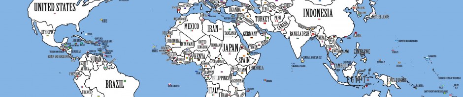
What if the world were rearranged so that the inhabitants of the country with the largest population would move to the country with the largest area? And the second-largest population would migrate to the second-largest country, and so on?

The result would be this disconcerting, disorienting map. In the world described by it, the differences in population density between countries would be less extreme than they are today. The world’s most densely populated country currently is Monaco, with 43,830 inhabitants/mi² (16,923 per km²) (1). On the other end of the scale is Mongolia, which is less densely populated by a factor of almost exactly 10,000, with a mere 4.4 inhabitants/mi² (1.7 per km²).

The averages per country would more closely resemble the global average of 34 per mi² (13 per km²). But those evened-out statistics would describe a very strange world indeed. The global population realignment would involve massive migrations, lead to a heap of painful demotions and triumphant promotions, and produce a few very weird new neighbourhoods.

Take the world’s largest country: Russia. It would be taken over by its Asian neighbour and rival China, the country with the world’s largest population. Overcrowded China would not just occupy underpopulated Siberia – a long-time Russian fear – but also fan out all the way across the Urals to Russia’s westernmost borders. China would thus become a major European power. Russia itself would be relegated to Kazakhstan, which still is the largest landlocked country in the world, but with few hopes of a role on the world stage commensurate with Russia’s clout, which in no small part derives from its sheer size.

Canada, the world’s second-largest country, would be transformed into an Arctic, or at least quite chilly version of India, the country with the world’s second-largest population. The country would no longer be a thinly populated northern afterthought of the US. The billion Indians north of the Great Lakes would make Canada a very distinct, very powerful global player.

Strangely enough, the US itself would not have to swap its population with another country. With 310 million inhabitants, it is the third most populous nation in the world. And with an area of just over 3.7 million mi² (slightly more than 9.6 million km²), it is also the world’s third largest country (2). Brazil, at number five in both lists, is in the same situation. Other non-movers are Yemen and Ireland. Every other country moves house. A few interesting swaps:

* Countries with relatively high population densities move to more spacious environments. This increases their visibility. Look at those 94 million Filipinos, for example, no longer confined to that small archipelago just south of China. They now occupy the sprawling Democratic Republic of the Congo, the 12th largest country in the world, and slap bang in the middle of Africa too.
* The reverse is also true. Mongolia, that large, sparsely populated chunk of a country between Russia and China, is relegated to tiny Belgium, whose even tinier neighbour Luxembourg is populated by 320,000 Icelanders, no longer enjoying the instant recognition provided by their distinctly shaped North Atlantic island home.
* Australia’s 22.5 million inhabitants would move to Spain, the world’s 51st largest country. This would probably be the furthest migration, as both countries are almost exactly antipodean to each other. But Australians would not have to adapt too much to the mainly hot and dry Spanish climate.
* But spare a thought for those unfortunate Vietnamese. Used to a lush, tropical climate, the 85 million inhabitants of Vietnam would be shipped off to icy Greenland. Even though that Arctic dependency of Denmark has warmed up a bit due to recent climate changes, it would still be mainly snowy, empty and freezing. One imagines a giant group huddle, just to keep warm.
* Jamaica would still be island-shaped – but landlocked, as the Jamaicans would move to Lesotho, an independent enclave completely surrounded by South Africa – or rather, in this strange new world, South Korea. Those South Koreans probably couldn’t believe their bad luck. Of all the potential new friends in the world, who gets to be their northern neighbour but their wacky cousin, North Korea? It seems the heavily militarised DMZ will move from the Korean peninsula to the South African-Botswanan border.
* The UK migrates from its strategically advantageous island position off Europe’s western edge to a place smack in the middle of the Sahara desert, to one of those countries the name of which one always has to look up (3). No longer splendidly isolated, it will have to share the neighbourhood with such upstarts as Mexico, Myanmar, Thailand and – good heavens – Iran. Back home, its sceptered isles are taken over by the Tunisians. Even Enoch Powell didn’t see that one coming.
* Some countries only move a few doors down, so to speak. El Salvador gets Guatemala, Honduras takes over Nicaragua, Nepal occupies Birma/Myanmar and Turkey sets up house in Iran. Others wake up in a whole new environment. Dusty, landlocked Central African Republic is moving to the luscious island of Sri Lanka, with its pristine, ocean-lapped shores. The mountain-dwelling Swiss will have to adapt to life in the flood-infested river delta of Bangladesh.
* Geography, they say, is destiny (4). Some countries are plagued or blessed by their present location. How would they fare elsewhere? Take Iraq, brought down by wars both of the civil and the other kind, and burdened with enough oil to finance lavish dictatorships and arouse the avidity of superpowers. What if the 31.5 million Iraqis moved to the somewhat larger, equally sunny country of Zambia – getting a lot of nice, non-threatening neighbours in the process?

Rearranged maps that switch the labels of the countries depicted, as if in some parlour game, to represent some type of statistical data, are an interesting subcategory of curious cartography. The most popular example discussed on this blog is the map of the US, with the states’ names replaced by that of countries with an equivalent GDP (see #131). Somewhat related, if by topic rather than technique, is the cartogram discussed in blog post #96, showing the world’s countries shrunk or inflated to reflect the size of their population.

Many thanks to all who sent in this map: Matt Chisholm, Criggie, Roel Damiaans, Sebastian Dinjens, Irwin Hébert, Allard H., Olivier Muzerelle, Rodrigo Oliva, Rich Sturges, and John Thorne. The map is referenced on half a dozen websites where it can be seen in full resolution (this one among them), but it is unclear where it first originated, and who produced it (the map is signed, in the bottom right hand corner, by JPALMZ).

—–

(1) Most (dependent) territories and countries in the top 20 of Wikipedia’s population density ranking have tiny areas, with populations that are, in relation to those of other countries, quite negligeable. The first country on the list with both a substantial surface and population is Bangladesh, in 9th place with a total population of over 162 million and a density of 1,126 inhabitants/mi² (56 per km²).

(2) Actually, the US contends third place with China. Both countries have almost the same size, and varying definitions of how large they are. Depending on whether or not you include Taiwan and (other) disputed areas in China, and overseas territories in the US, either country can be third of fourth on the list.

(3) Niger, not to be confused with nearby Nigeria. Nor with neighbouring Burkina Faso, which used to be Upper Volta (even though there never was a Lower Volta except, perhaps, Niger. Or Nigeria).

(4) The same is said of demography. And of a bunch of other stuff.

Source: Strange Maps, one of the best weird but so special blogs out there and one of my obvious favourites! 🙂

If It Was Your Home…

There has been relatively little talk about the BP oil spill. For such a big disaster, I’m surprised there haven’t been many people calling BP out on the matter. Especially here in Greece, the matter seems to be getting little attention. Hopelessly little when it’s the largest natural disaster to hit the US we’re talking about. One could say that Greece has its own problems at this time, but even like that, people just don’t seem to care unless it’s their home.

So, what if it was YOUR home?

This is what the people behind www.ifitwasmyhome.com must have thought… It’s a site trying to raise awareness about the BP oil spill. It has live streaming video of the spill (yes there’s a camera thousands of meters below the surface) but most importantly, they have a Google Map with a representation of the oil spill layered on it, at the location of the actual spill. This is a great way to comprehend the extent of the damage done, but for anyone who’s not from New Orleans or the southern coast of the US it means little. What’s best about the site is that you can move this layered spill anywhere you want in the world and see what it would look like over your home. I put in my post code in Nea Smyrni and this is what came up.

(please click it. Screenshot taken June 7th 2010)

And what about the creatures whose home was the Gulf of Mexico? The photographs speak of themselves. I’m warning you, they’re not easy to swollow…

I am lost for words… There’s nothing that has not been said anymore. Things will only change if people unplug their ears and, most importantly, their minds…

source: StrangeMaps

The top 250 best movies of all time Map

Also from strangemaps.wordpress.com (I just found it linked there, it’s not hosted there), I found the following.

http://blog.vodkaster.com/2009/06/25/the-top-250-best-movies-of-all-time-map/

mapglance2

Based on the Top 250 movies on IMDB, June 2009.

Awesomest thing in the history of the known and unknown multiverse.

t-rex

This seriously made my night. Not that my night had any problem; the pic just made it better.

Taken from strangemaps.wordpress.com – Post #420. Link on the pic. Strange Maps is a fascinating site, I recommend it to anyone, especially of course to anyone even mildly interested in geography, maps and the odd in general.