Yesterday I rolled up my sleeves and decided it was time for a new theme. I started up the Weaver II customiser but nothing I could come up with was better than, or even comparable to, the -also customised- theme I had before.
Then I realised that there was this new theme Twenty Fourteen WordPress had put up with their new release of the platform, as has become tradition. It’s the theme you can see right now plus a few tweaks I made which mainly have to do with Greek font support, different fonts for headlines, content width and the awesome “background” to the right I made in Photoshop.
It isn’t obvious -even I forget what this place used to look like in all its different itterations- but this theme is the fifth one I’ve used since Cubilone’s Dimension first came to be back in 2007. Today I wanted to remember what the site used to look like, how it’s changed and evolved throughout all these years. I played around with the themes still in my virtual dresser for a little while but then found another, much better way of looking back.
Enter The Wayback Machine, an unfathomable web archive that screenshots pages at random intervals from all across the Internet and uses them to create a historical archive for the ever-changing face of the digital world. Fortunately, this here too site didn’t escape the vortex, so allow me to take you for a short ride through Cubilone’s Dimension’s modest history.
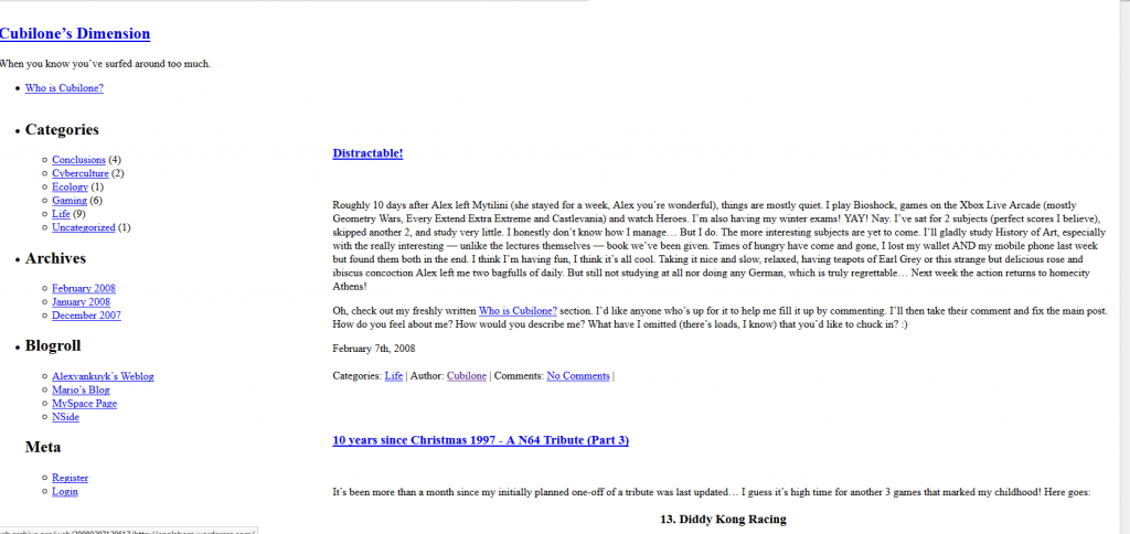
Version of the site from early 2008. Back then the blog’s URL was simply http://cubimension.net. The references haven’t changed in the archived html and so the saved img src’s and href’s pointing to the background and CSS files are now pointing to nowhere; screenshots after ’09 don’t have this problem as that is when I created the main hub and corkboard and moved the blog to its current directory (/blog). The theme and background remained the same throughout 2007, ’08 and ’09, the same as the one in the following picture.
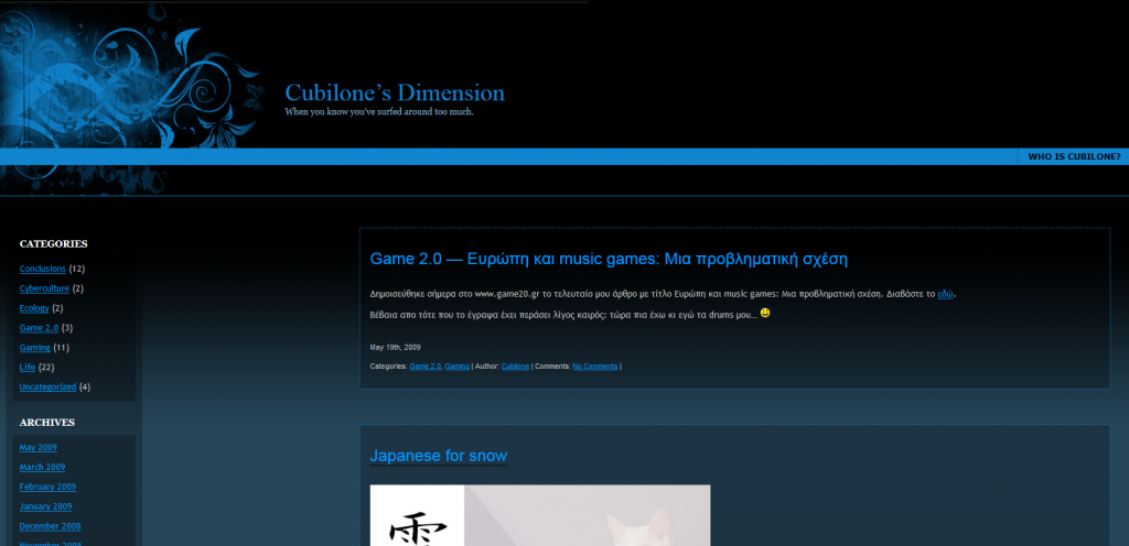
June 1st 2009 – first screenshot from after I had moved the blog to /blog because of my work on this, a primitive portfolio site but mostly an exercise on CSS (I made it for uni). Eesh, I can’t even look at that… thing!
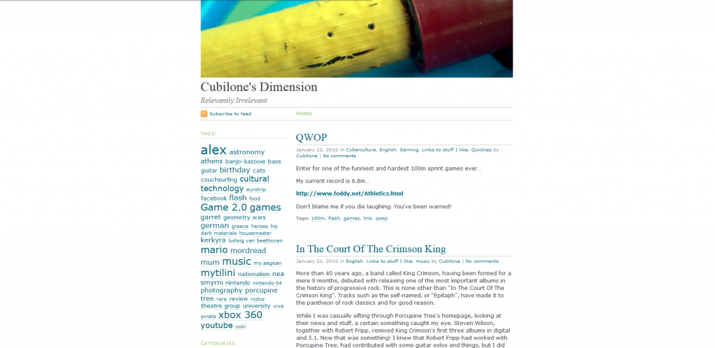
January 22nd 2010 – Tired of all the dark blues and blacks, I opted for something a little bit brighter. I like the photogallery at the bottom of the sidebar to the left, back when I uploaded lots of my photograms. That’s also roughly the period when I started posting more, trying to fend myself off Facebook by replacing status updates with posts.
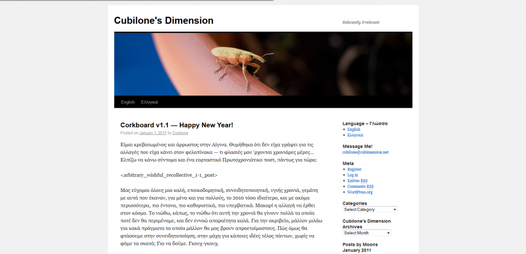
January 9th 2011. I went for a standard theme here to freshen things up a bit and streamline the blog experience, just as I did 3 years later (now). This theme was very transient because a few days later I custom-designed this:
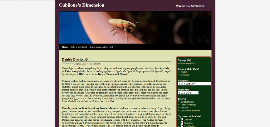
August 7th, 2011. I was in Denmark then but the theme had been online for some time already. I can’t remember where I was when I was designing it – memories of me being in Mytilini and Athens at the same time both seem false, but the gist is that it was somewhere in the first quarter of the year, a lonely time in general, a time when I had all the time to fine-tune the theme to suit my taste. There was also a tiled floorboard background then which has since been replaced by the background that came next and so doesn’t appear on the Wayback Machine.
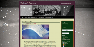
And here we are today. At some point mid-2012 I replaced the header and the background to better suit the mood I had then.
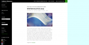
I had been using the same theme until yesterday, when I finally made the change from this custom theme I had grown to love but which I had never realised I hadn’t changed for more than 2.5 years to the one I’m using now. For historical purposes (who knows what the future might bring?) I’m also leaving a screencap of the brand spankin’ new one right here:
Thank you for this short tour, have a nice evening or day!

Wah! Everything is so bright and white! What is this purgatorium of a blog?
Ah, the twentyfourteen in action, I was considering this theme, as I am having trouble to make it look as I wanted to. This one looks … interesting.
Not sure about this one though.
It is like a black/green facebook thing. Once the “oh this is different” has worn off, I will be able to judge it a bit more objectively.
Other than that, the rate at which you update this blog makes me envious and motivated.
keep at it.
“This one looks … interesting.
Not sure about this one though.”
???
I think it looks cool and there are some plugins and stuff that let you customize stuff like fonts and column width. I find it’s more like Windows 7 and less like Facebook, which is not a good thing generally, but you get used to it I guess. Did you prefer the theme I had before?